The Oscars are upon us once again. So as I did last year, here is a review of the 2011 Oscar nominees’ posters. Movie posters are an excellent marketing tool. They serve as a visual explanation of what the movie is about and can sometimes make or break a viewer’s decision to go and see it. Unfortunately there is not always a direct correlation between a good movie poster and a good movie. That said, let’s take a look at this year’s cream of the crop.\n\n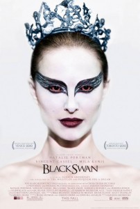 Black Swan\nThere were two very different posters done for this movie. The above is the one released stateside. It is a straight-on shot of a red-eyed Natalie Portman in full black swan regalia with an enigmatic Mona Lisa smile set against a highly contrasting white background. The contrast is interesting, maybe representing being in the spotlight or the innocence of ballet. Or maybe it’s just a juxtaposition of color used to emphasize the heavy make-up and sinister expression. Either way, it’s a good representation of the movie. Rating 4/5\n\n
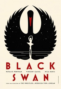 In addition, there was a second set of limited edition, art deco-inspired posters released internationally. (The film wasn’t released outside of the U.S. until after the new year). There were a total of four posters in this series, all of which I think were beautifully done and a testament to the power of good design. They are simple but well executed with a three-color palette of black, red and cream, interesting typography and clever illustrative use of negative space that captures different aspects of the movie. Rating 5/5\n\n
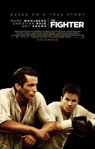 The Fighter\nThis poster was one of my least favorites. With such a powerful title and two big name movie stars, it wasted so much potential. The photography of Mark Wahlberg and Christian Bale leaning against the ropes of a ring looking slightly pensive and uninterested is underwhelming. If a picture is worth a thousand words, there is only one that comes to mind, boring. The photography could have been far more interesting and dynamic. The same goes for the typography. With a two word title like this, it could have been more creatively executed with something more bold and unique. The whole look is too safe, uninspiring and lacking a fighting spirit. Rating: 1/5\n\n
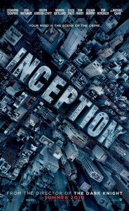 Inception\nThe poster for this interesting and mind-bending movie was well-done. It does a good job of capturing the look and feel of the movie with the foreboding use of the grays and blues. The movie title is creatively executed so that it is mimicking the other buildings. This movie had multiple posters, but this one was by far my favorite. It represents the movie well, is smart and well executed. Rating: 5/5\n\n
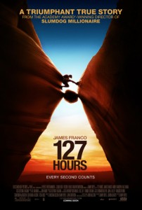 127 Hours\nThis poster does a great job showcasing the spirit of adventure and creating a visual tension for the protagonist. Caught precariously between two rock formations, its as if to say he is between “a rock and a hard place.” (Which from my understanding is an underlying theme to of movie.) The photography is well chosen with the gorgeous colors of the sunset as a backdrop. I liked the fact that there was tagline of “Every Second Counts;” it is a nice addition. Rating: 4/5\n\n
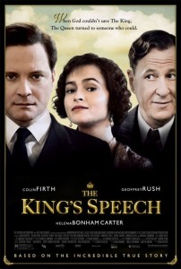 The King’s Speech\nThis poster leaves a lot to be desired. The three main characters are shown, but the fact that they are looking in different directions eliminates any connection between them. The choice of photography is questionable and unflattering. Since the story is based on royalty, they should look far more dignified and refined. I also don’t understand the clouds in the background. Something denoting the war might have been a better choice considering the film is set during war time. I think that this poster lacks any real thoughtfulness or creativity. It looks like a period-piece poster template from the mid-90’s. Rating: 1/5\n\n
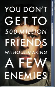 The Social Network\nThe “Facebook” movie poster is interesting. The type over the face of the main character makes it look much more like a book cover then a movie poster. The statement is provocative and is a good tease to the movie’s theme. The type over the face may also serve as a visual metaphor for the main character taking up an endeavor that completely overtakes him, for better or worse. The Facebook-branded sidebar on the right of the poster, however, is unnecessary and out of place. If the poster was trying to emulate a Facebook page that would have been a good solution but combining the two different themes certainly doesn’t work. Rating: 2.5/5 \n\n
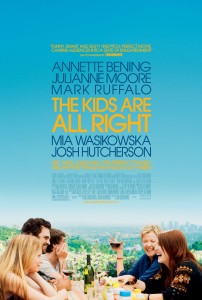 The Kids Are All Right\nThis poster is all right. The type being front and center is nice and the color palette is smart. The blue and yellow go nicely together and provide an overall cheery outlook. The photo shows the family from the movie gathered around a meal smiling and laughing. This is slightly misleading since the theme of the movie is centered around the “alternative family.” This photo does not really capture that and I can’t help but wonder if that is because they didn’t want to emphasize the sensitive topic of same-sex parents. I think I would have rather seen an illustrated solution for this poster. It could have been a more creative and clever way to explain the premise of two lesbian parents and their children who go looking for their biological dad. Rating: 3/5\n\n
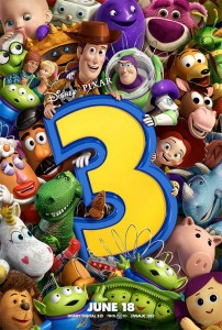 Toy Story 3\nThe Toy Story brand is very well established. For its third installment, the poster is fantastic. It includes all of the toys that are included in the movie with our heroes, Buzz and Woody atop holding the number 3. Visually there is a lot to take in reminding me of one of those arcade games that is a filled with toys and has a mechanical “claw” to pick them up. Overall it is a fun and colorful poster for a beloved movie franchise. Rating: 4/5\n\n
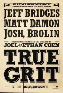 True Grit\nThe poster is a straightforward typographical solution. The Western theme is clear with the bold use of type and yellowed paper. The bleeding bullet hole is an interesting element, foretelling gun play. The movie type could have gone on the top and the actors’ names could have been smaller and possibly depicted through daguerreotype photography that was common at that time. Overall, it’s a good poster, but it could have been better. Rating: 3/5\n\n
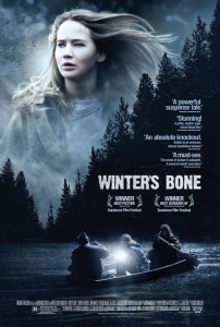 Winter’s Bone\nThis independent movie has a very mainstream feel to its poster. The overall mood is dark and serious. The premise of the movie is that the main character is looking for her dad, and I think that is shown well here. She certainly looks like she is in search of something. Overall, I think that the poster is well done. I especially like the silhouette lining of trees as it does a great job of breaking up the space into an interesting v-shape. Rating: 4/5\n\n\n2011 Oscar Winner of the Best Movie Poster goes to: Black Swan for their illustrated poster series
 More than Sauce: Branding Diversity
  Getting the Most Out of Conferences
  The Company That Cried “Innovation” and a Ridiculous Case Study That Has To Do With Cats